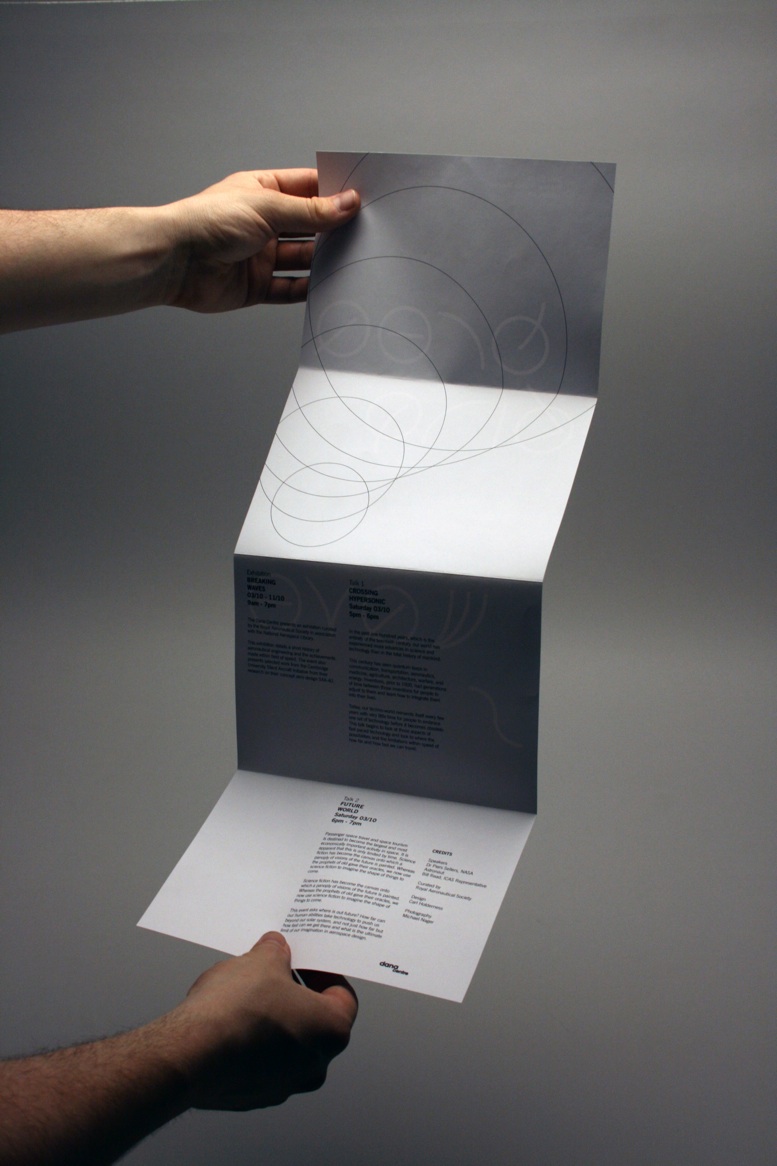
Friday 3 June 2011

FMP Evaluation

A bulleted summary of things that were good, bad and what I will improve upon:

Brief 1; Doppler:
+ Professionally finished and crafted deliverables that was presented well through well considered stock choices, formats, photography and layout.
+ Produced more than 1 typeface for the brief.
+ Produced a conceptual typeface which resulted in being in the line for a placement at Raw Design in Manchester.
+ Developed the brief into a much larger brief that showed how a conceptual typeface could be used in situ.
+ Gained a new contact within Manchester and recognition by a large northern type-based agency.

- I could have produced some explored and proposed quick online content for the brief.
- More initial research into sound could have been explored into different directions that the design could have taken.
- I could have taken the development further and produced a typeface that was perhaps more functional.


Brief 2; Made:
+ Successfully delivered a live pop-up shop event within the college.
+ Produced a vast range that covered lots of different formats, type design, online promotion, print campaign, and merchandise. I also worked initially on getting the vendors to apply for the shop through a poster and email campaign through the college.
+ Innovative use of type for a pop-up event.

- Spending too long with small ammedments for the client and not simply saying no.
- Not considering placement of logos, as I feel that the placement of these could have been considered better.
- Not defining my role within the pop-up shop properly leading to having more leadership in when and what happened with the pop-up shop status.
-Spending too much time hand-printing material when i should have commissioned someone to do it.
- Not properly exploiting the visual possibilities using the typeface that was produced.
- Not exploiting the possibilities of a range over a period of time, i.e. pop-up shop 3, 4, 5 etc.
- Should have explored more the possibility of large signage to get people to the event inspite budget restrictions. Giant mock-up letters, wall vinyls, painted up letterforms etc.

Brief 3; Foxx:
+ Choosing to decline continuing with the client after parts of the brief, the general direction and insufficient feedback did not start going to plan. The brief then gave me the opportunity to create something that I wanted to produce.
+ Creating well crafted mocks of the final material and considering detailed aspects of delivery when creating merchandise.
+ Large amount of early development and exploration into the design of the logo.
+ Good wealth of research into the band's competition and generic resarch to inform the design direction.

Brief 4; Photography Yearbook:
+ Working within a collaborative practice to better understand the benefit and downfalls of working as a team.
+ Helping to craft the yearbook mock-up to give a better finish.
+ Understanding and implementing a row structure within the layout to give a better versatility within the layout for the photography.
+ Contacting printers to help get quotes and negotiate our proposals. Ad arranging visits to better understand the process.
+ Learning the importance of proofing, the importance of alignment, consistency and appropriateness of stock and knowing to check check check.
+ Helping to produce a brilliant mock-up of the final book.
+ Working on producing the end of year promotion to create a more substantial brief.

- Not being honest enough and holding back when it comes to design decisions and not pushing concepts further.
- I feel I could have been far more professional when it came to delivering work on time and I do feel I let down my colleagues when it came down to making decisions further down the line.


Design Context
+ Learning more about the industry within type which has hopefully led to placement opportunities.
+ Quality and craftsmanship.
+ Considering the format of the publication and how it could be used to best showcase the research in a format that will be used over a length of time.

- Not collecting enough primary research.

General Comments
+ Selection of live briefs gave me a good indication of working with a variety of clients.
+ Finding I was more happy to work with myself rather than working within a collaborative
+ Greater appreciation for craft, particularly when it comes to producing mock-ups to pitch to clients.

- Need more briefs that show an ability to carry a range through not just 1 event/issue but consider the longevity of issues/multiple events such as a magazine or a monthly event.
- Select a brief that looks towards packaging, possibly a more substantial publication design.
- Consider producing typefaces with font files and type specimens.
- Should have considered completing a student competition brief as part of my FMP.
- Not looking and enough and specific contextual sources to inform the development of my practice.

Thursday 2 June 2011

Photography Yearbook Submission Boards

Photography Yearbook

Brief
Design the Photography yearbook publication to be delivered as part of their end of year show exhibition.


Boards:

All Aboard Records Submission Boards

All Aboard Records

Brief
Revitalise the image of All Aboard Records through a redesign of the identity.


Boards:


End of Year Show Submission Boards

End of Year Show

Brief
Design the Photography yearbook publication to be delivered as part of their end of year show exhibition.


Boards:


Raw Type Submission Boards

Raw Type (Part 1 & 2)

Brief Part 1
Create a typeface based upon themes of either time,
sound, photography or light and produce a promotional
poster for the typeface design.


Brief Part 2
Using the Doppler type as a basis for the design
direction, propose how the typeface could be used in
context.


Boards:

Foxx Submission Boards

Foxx

The Brief
Create an identity for the indie band Foxx and
propose a range of printed merchandise
material that links with their new visual
aesthetic.


Boards:


Made Submission Boards

Made

Brief
Name, design and promote the second event of the
Leeds College of Art Pop-up Shop.


Boards


Finished Context Publication


Factory Four Submission Boards

Factory Four

Brief
Revitalise the image of Factory Four through a new logo concept.


Boards:

Wednesday 1 June 2011

Foxx Type Specimen Poster Development

Raw Type Part 2 Visual Exploration


Breaking Waves will be the names of the exhibition after trying several different ideas, the two worded naming provided the best opportunity compositionally and gave more substance to the typeface that was used instead of using it for just a single word.

The dana centre hosts talks that are predominently trageted at professional scientific careered individuals the style of the exhibition had to therefore communicate this to the select audience.
More basic compositions involving shapes formed the basis of initial ideas.

Raw Type Proposal for Part 2


Based upon final crit feedback I was told I should expand some of the ranges within my current briefs as although it was clear that a lot of work had gone into designing type it didn't necessarily come through on the deliverables that were produced.

For this reason I have decided to expand the Raw Type brief and proposed how the typeface could be use in situ within and exhibition design and it's event promotion.

I mocked up a small range of deliverables that could be produced as part of the range within this small extra brief. Hopefully these two briefs should work together and show better how the typeface I produced could be used.

Raw Type Initial Drawings and Sketches

Based upon the initial research into looking at the breaking of sound barriers I started sketching some initial ideas using circular patters to create abstracted letterforms.
Going back to the initial image that i had collected as part of my initial research the best simple solution i had found was using the pattern of rings with a thicker line going through to illustrate a letterform through this line's direction and length.


To best communicate the difference between what would be a moving object and the resulting sound waves a thicker line was created to best illustrate what was going on within each letterform. A variety of weights were tested below to best represent the letter forms within a variety of scales.


I also started to experiment here with breaking the concept down that I had created to make a more simple and less conceptual creation. This other typeface could be integrated as an actual face besides being a simply decorative piece.

Raw Type Initial Ideas and Research


Visually presenting sound seems quite challenging and perhaps difficult because of the fact that it is invisible. Upon initial research I found various scientific theories surrounding sound particularly within the field of speed and breaking different sound barriers, such as the Mach scale.

The Doppler effect is a science I thought was rather interesting as the diagram below explains:

The source of a waveform—such as sound or light—sends out a wave at a regular rate or frequency. But if that source is moving, it starts to catch up to waves in the direction of motion, as well as pulls away from the waves opposite the motion. The velocity of the waveform does not change, but the wavelength and frequency does change due to the motion of the source.

This causes the wavelength in the direction of motion to be shorter and their frequency higher. Likewise, the waves moving in the direction opposite the motion of the source will have longer wavelengths and lower frequencies.


There are many videos within youtube of aircraft flights that show this doppler effect and the breaking of the sound barrier. Really interesting and have started drawing sketches based upon the waves represented by the diagram above. The challenge of all this is to create something that will by visually engaging but also be somewhat in the realms of readable. I do doubt that symbolism of letterforms will be sufficient for a good shot at the placement in Manchester.

Ticket Design


Design Development for the ticket design for the breaking waves exhibition at the Dana Centre, London. From initial directions the final design came together to co-inside with the poster design, using the darker imagery for the background.

The designs were then perforated and foiled to give a high spec considered finish.


Changes to Exhibition Guide

After spending most of the evening last night in the print rooms I was disappointed with the exhibition guide that I had designed. The format was simply too small and the amount of detail within the design didn't reflect the minimalist aesthetic that I had used for the design of the rest of the promotional material.


Joe suggested using a longer more custom format similar to his chromatologies leaflet would be more appropriate. Keep the design minimal also and avoid putting those images of aircraft in as it let the view know too much before they enter the exhibition. Instead use the consentina fold as more of a design feature as oppose to simply a format and hopefully the design of the type will come though as the strong communication tool. The result was far better.

Raw Type Part 2 Ammendments

With the second part of the brief well underway I was disappointed with the printed outcomes from downstairs, even it they are from James' printers. Had to go through a way colour changes to get the right look that I wanted through adding more channels and simply altering the colour balance of some of the images. Overall however I am really pleased with the colour. It is far more dramatic and gives a really good perspective on high altitudes nearing space.

Added details for Tote Bag

For the design of the tote bag which is printed two colour I created a quick label which is attached. Although Joe did say that the barcode does not look really I would still very impressed of the consideration behind the design.

The design is black foiled onto a 250gsm card.


Exhibition Mock-up for Raw Type Part 2

To give a better impression of a considered approach to the range i've proposed an exhibitions space that utilises the type design as part of the interior signage for the event. For this I simply used google sketch-up as it is free and fairly simple to use once you get your head around it.

I actually had no initial drawings or sketches for these so the design came about as a made it. The renders that were produced were actually very detail and could be scale upwards for a print quality resolution.

Design Development for Context Calendar

I started playing around with the format today for the design context publication. I chose to design a calendar on a personal decision, I felt it would be something far more unusual and if crafted well reflect my practice at its best. I also chose it for it's longevity and the more engaging value of having a calendar in constant view for a year, I feel I would love to have this calendar on my wall than a book that collects dust on a shelf.


Based upon the ongoing research that I have been undertaking on the blog for my design practice the calendar will form a achromatic documentation of several typographers and design studios that have influenced my practice over the past year or so. The calendar will give an opportunity for any new designers starting out in type design a good number of designers to look out for and links of books and websites that are particularly useful.


I liked the idea of showcasing a particular piece of type on the front of the calendar with a perforated peel-off design so that the back ban be read for more information on the designer/typographer.


The document below illustrates the layout and the order of the selected designers that will be used for the calendar design.

Doppler Type Specimen and new Promotional Poster

I quickly produced a specimen booklet to showcase the experimental typeface that I produced. The booklet shows the two typefaces and the science behind the design.


Monday 23 May 2011

5 Questions for Formative Feedback

01. My design context publication is a calendar format, the content is about 12 different type designers whom's work i have referenced over the course of my design practice. The front of each month will detail a typeface, a bit about the studio/designer, 5 links to websites, 5 links to a books. the back will detail more information about the studio, their practice, reference to their type foundrys aswell as a selection of imagery of their work.
Any suggestions on improving it's layout, i.e large letter on front?

02. Would you suggest any more quick expansion ideas of the foxx brief?

03. To be honest I'm struggling resolving my briefs so I can get the best out of each one, any advice/comments that would vastly improve quality of some of the briefs?

Sunday 22 May 2011

http://www.gavillet-rust.com/works-0-1

Friday 20 May 2011

Made Event At the Leeds College of Art

After all my hard work on the project the Made event finally took place. The shop was setup beautifully by both Bridget and Gina and a number of volunteers, the change in placement of the shop was decided upon as there was not enough space within the glass foyer. Bridget and a couple of helpers also made some bunting which decorated the event beautifully.
The flyers ended up reaching as far as a spa in Cleckheaton just outside of Leeds. The pop-up shop also took better profit on the second day as it was open throughout the day, but was met with a disappointing amount of sales during the Creative Networks event on the thursday.
Regardless of this each vendor that produced work sold something during the entire pop-up shop and gained good exposure for it's first trial at the Leeds College of Art Blenheim Walk building.

F4: Context K2 Screen Printers

K2 Screen Printers is one of the leading specialist silk-screen printers in London. Unlike K2, Factory four offers additional services and lower rates. Their identity is actually very similar to the new logo I have created for factory four. I am unsure as to whether I should consider looking again at the logo design.

PlayType Store Copenhagen


http://www.playtype.com/store

A Must ipad App: Typesetter

I love the concept behind this. I couldn't actually find this on itunes though. (via upscale typography)