Monday, 23 May 2011

5 Questions for Formative Feedback

01. My design context publication is a calendar format, the content is about 12 different type designers whom's work i have referenced over the course of my design practice. The front of each month will detail a typeface, a bit about the studio/designer, 5 links to websites, 5 links to a books. the back will detail more information about the studio, their practice, reference to their type foundrys aswell as a selection of imagery of their work.
Any suggestions on improving it's layout, i.e large letter on front?

02. Would you suggest any more quick expansion ideas of the foxx brief?

03. To be honest I'm struggling resolving my briefs so I can get the best out of each one, any advice/comments that would vastly improve quality of some of the briefs?

Sunday, 22 May 2011

http://www.gavillet-rust.com/works-0-1

Friday, 20 May 2011

Made Event At the Leeds College of Art

After all my hard work on the project the Made event finally took place. The shop was setup beautifully by both Bridget and Gina and a number of volunteers, the change in placement of the shop was decided upon as there was not enough space within the glass foyer. Bridget and a couple of helpers also made some bunting which decorated the event beautifully.
The flyers ended up reaching as far as a spa in Cleckheaton just outside of Leeds. The pop-up shop also took better profit on the second day as it was open throughout the day, but was met with a disappointing amount of sales during the Creative Networks event on the thursday.
Regardless of this each vendor that produced work sold something during the entire pop-up shop and gained good exposure for it's first trial at the Leeds College of Art Blenheim Walk building.

F4: Context K2 Screen Printers

K2 Screen Printers is one of the leading specialist silk-screen printers in London. Unlike K2, Factory four offers additional services and lower rates. Their identity is actually very similar to the new logo I have created for factory four. I am unsure as to whether I should consider looking again at the logo design.

PlayType Store Copenhagen


http://www.playtype.com/store

A Must ipad App: Typesetter

I love the concept behind this. I couldn't actually find this on itunes though. (via upscale typography)

Thursday, 19 May 2011

Type based Blogs/Websites

http://www.typographicposters.com/#/

http://www.aisleone.net/2011/typography/codex-the-journal-of-typography/

http://typographica.org/

http://typophile.com/

http://www.nineteeneightythree.com/

http://fontfabric.com/

http://ilovetypography.com/

http://www.typographyserved.com/

http://www.typetoken.net/

http://upscaletypography.com/

http://www.rawtype.co.uk/

http://www.typojungle.net/

http://www.youworkforthem.com/

http://tdctokyo.org/eng/

http://reformrevolution.com/

http://www.playtype.com/

http://www.hypefortype.com/

http://www.typecuts.com/fonts.php?kid=4

Type Based Magazines

Baseline

Codex: The Journal of Typography

8faces

slanted

eye

typo

Foxx Type Poster

Finishing the brief is now here. From having a quick tutorial with Joe he recommended finishing the brief of with a typographic based poster to promote the typeface. He suggested do it quickly to resolves the brief and get it photographed properly to show the detail in finishes I had gone to. Below are the poster samples with the first being the one I am printing.


Bratislav Milenkovic


Stefan Schuster

Wednesday, 18 May 2011

Made on Pop-up Events

Foxx Label Embossing + Spot Varnish

For the design of the packaging I wanted to communciate a high end feel through use of print finishes stock choices and general atention to detail. For the design of the labels I used an blind embossing effect created through passing it through the printing press. Overall really happy with the results.


Pattern ideas for the packaging (google):


Final detail to be spot varnished onto packaging:

Pop-up Shop Promotion - Pop-up Events

Amber was asking around in the studio today to see if anyone wanted to have a portfolio surgery with the Beautiful Meme. Unfortunately with the number of brief I am currently still working on it would be very hard to accept and still get all my work finished. I did however have a good luck at their website and am impressed by what they do.

I also noticed they did some work for a website that hosts notifications for pop-up shop events around Yorkshire, I've told bridget to get in touch and hopefully we will have our work displayed on their website as well.

Tuesday, 17 May 2011

Foxx Typeface Development

Based upon crit feedback it was suggested that I extend the type work further by creating a full typeface that could be used as part of their branding scheme. Working from the few characters that I had already created I experimented with certain characters and how I could adjust their simple fors to create something more interesting and all together more 'mystical'. These type based elements included dots in place of lines, double lines, more geometric letterforms,

I started playing around with interesting compositions involving pangrams which I though could be used on merchandise. Having experimented I have now prepped a screen to have the t-shirt printed. More to come.

Foxx Brief

The brief for the foxx branding brief.


Vincent Font via TypographyServed


Workshop via ThisisWorkshop


María José Torrero Heredia via TypographyServed


Monday, 16 May 2011

Logo Ideas & Development


Logo and Fox-Related Band Research

As it turns out there are a wealth of bands that include fox within their names, I also started looking further afield, looking more at other companies such as pubs, clothing and even eco-companies that go by a name that includes fox.

There are a variety of interesting literal visual interpretations that use the fox tail or an illustration of a fox as part of their commercial branding. Silver Foxes, the Foxes and Fleet Foxes have type-based logos that don't use illustration.


Fleet Foxes are probably one of the biggest with a visual style lit with rural-esque painting style imagery, much like to convey a british history probably to do with fox hunting. The typeface is an uppercase serif which overlays the imagery. Overall the visual style is really nice and communicates a heritage value within the music they produce, to suggest a very acoustical/indie value within the music.


The Foxes are another indie style band with a visual direction that simply uses the name as type within the logo. Not very visually interesting identity but they seem successful and it is clean and consistent.


Foxes! (above)


Silver Foxes (above)


Taming Foxes (above)

Email Conversation with Beth for Foxx Branding

Satisfied with the design direction of the project I quickly mocked up some t-shirt designs using the logo. Playing on the idea of a Pangram (link) the typeface used on the logo is continued and for the other t-shirt a woodland image is placed in front of the text.

I sent the designs to Beth in a PDF format. Although I probably could have pitched several design i felt this design and the strong research behind it was sufficient to justify the direction:

Foxes by folklore are regarded as symbols of cunning and trickery and are considered almost mythical. The logo is designed to communicate these concepts onto the branding of the Foxx Band. Irregular character features are used to communciate a mythical feel, the design is also lit with monotone imagery and a strong orange colour overlayed on the top.

Tone of Voice:
Eclectic, unusual, bold


Beth responded soon after requesting the brief be handed in later and a posted format to be sent to an address. Realising that this process could draw out the length of the brief I declined to continue the brief forward and made the brief into a short brief as part of my project work only.

Fox (disambiguation)


In many cultures, the fox appears in folklore as a symbol of cunning and trickery, or as a familiar animal possessed of magic powers.

A Kitsune is a nine-tailed fox in japanese folklore is a mythical fox which has nine tail and posessed magical abilities.


Other useful articles on mythical beings:

+ Top 10 real mythical animals (link)
+ Wikipedia's long list of Mythical Creatures (link)

Made Poster Printing

The made posters will be printed as cheaply as possible instead of digitally print the posters which would cost £75 I am screen printing the posters which should cost around £10 inc paper, inks, screen coating etc.

The tactile quality if a screen-print is also far more appropriate to the made event itself. I have costed up the cost of having the posters printed using a risograph printer which would give a similar effect:

50x A3 £25

The problem was the time for manufacture and delivery which is a total of 3 days manufacture + first class delivery. Unfortunately with just over a week to go there is not enough time.


Final Artwork for screen-print:


The posters were then fed through a laser printer with the black information detail. Costing: nothing.

Friday, 13 May 2011

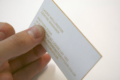
F4 Business Card Mock-up

For the F4 identity brief I screen printed some stationary items that they could use for their invoicing and documentation. The stationary is printed in gold which will be a running identifying colour throughout the company.