Showing posts with label OUGD303DC. Show all posts

Tuesday, 29 March 2011

Year Book Packaging Contextual Research

The photography students are looking for a limited edition of their book to be given to select individuals which should encase a limited edition print of on of their pieces of work. Initial ideas were to do with encasing the print within a gatefold at the beginning or end of the publication.

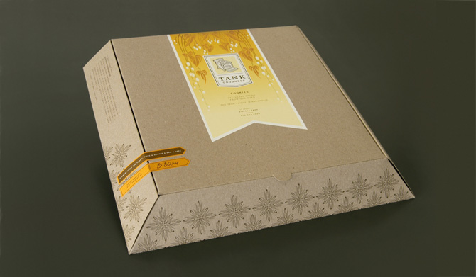
I propose having a edition of books encased in packaging with a print enclosed, this has far more advantages:

+ A gatefold does not properly encase the print and may slip out.
+ The gatefold is costly, and adds around £500 to our budget. This is due to it being hand folded, a large amount of stock required and a lot of paper waste.
+ The gatefold has to be used within all the yearbooks as it it too costly to limit to say 50.
+ Packaging in a number of 50 means they can be produced within college by hand by us and the photography students.
+ There are a wide range of packaging formats and they can protect what is enclosed unlike the gatefold.
+ Finishes can be added to add a limited 'special' feel to the editions.

There are many formats a few initial ideas I had included:
- Boxes (although these could be expensive)
- Thin Book Bags
- Bubble wrap bags
- Cellophane wrap
- Plastic bags
- Paper Wrapping + Stickers

Monday, 28 February 2011

Tuesday, 8 February 2011

Printed Textiles

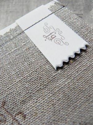
As another one of my identities on the way I have been asked to produce an actual identity for a forthcoming graduate at Huddersfield University. She is in the textiles trade and as a graduate is looking to offer her skills to work either in an established textiles agency or as a lone practitioner offering her product a a business. I have written a brief and began looking at some sources of inspiration, I found this identity from Workshop really nice.

Love

Via Typography Served.

Pulp

Pulp is a book by London based agency KentLyons in collaboration with Generation Press and GF Smith celebrating the process of making paper.

Fedrigoni Previous Winners

Limited Colour

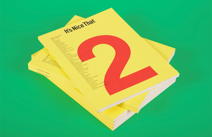
It's Nice That publications, love the list on the front, bright stocks and monotone imagery.


More Studio, Love the strong orange, mixed with delicate serif details.


Pau Mau, bring coloured stocks into the publication design, it has a real depth. against the black and white imagery.


Misc & Tim Wan, overlay of colour.

Monday, 7 February 2011

Box


I really love the concept of encasing the yearbook in a box or sleeve, I also love this image for the identity design of all aboard records and how it can be spread across media and the design direction. Image via Graphic Exchange.