Showing posts with label Raw Type Part 2. Show all posts

Thursday, 2 June 2011

Raw Type Submission Boards

Raw Type (Part 1 & 2)

Brief Part 1
Create a typeface based upon themes of either time,
sound, photography or light and produce a promotional
poster for the typeface design.


Brief Part 2
Using the Doppler type as a basis for the design
direction, propose how the typeface could be used in
context.


Boards:

Wednesday, 1 June 2011

Raw Type Part 2 Visual Exploration


Breaking Waves will be the names of the exhibition after trying several different ideas, the two worded naming provided the best opportunity compositionally and gave more substance to the typeface that was used instead of using it for just a single word.

The dana centre hosts talks that are predominently trageted at professional scientific careered individuals the style of the exhibition had to therefore communicate this to the select audience.
More basic compositions involving shapes formed the basis of initial ideas.

Raw Type Proposal for Part 2


Based upon final crit feedback I was told I should expand some of the ranges within my current briefs as although it was clear that a lot of work had gone into designing type it didn't necessarily come through on the deliverables that were produced.

For this reason I have decided to expand the Raw Type brief and proposed how the typeface could be use in situ within and exhibition design and it's event promotion.

I mocked up a small range of deliverables that could be produced as part of the range within this small extra brief. Hopefully these two briefs should work together and show better how the typeface I produced could be used.

Ticket Design


Design Development for the ticket design for the breaking waves exhibition at the Dana Centre, London. From initial directions the final design came together to co-inside with the poster design, using the darker imagery for the background.

The designs were then perforated and foiled to give a high spec considered finish.


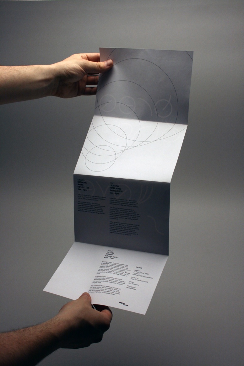
Changes to Exhibition Guide

After spending most of the evening last night in the print rooms I was disappointed with the exhibition guide that I had designed. The format was simply too small and the amount of detail within the design didn't reflect the minimalist aesthetic that I had used for the design of the rest of the promotional material.


Joe suggested using a longer more custom format similar to his chromatologies leaflet would be more appropriate. Keep the design minimal also and avoid putting those images of aircraft in as it let the view know too much before they enter the exhibition. Instead use the consentina fold as more of a design feature as oppose to simply a format and hopefully the design of the type will come though as the strong communication tool. The result was far better.

Raw Type Part 2 Ammendments

With the second part of the brief well underway I was disappointed with the printed outcomes from downstairs, even it they are from James' printers. Had to go through a way colour changes to get the right look that I wanted through adding more channels and simply altering the colour balance of some of the images. Overall however I am really pleased with the colour. It is far more dramatic and gives a really good perspective on high altitudes nearing space.

Added details for Tote Bag

For the design of the tote bag which is printed two colour I created a quick label which is attached. Although Joe did say that the barcode does not look really I would still very impressed of the consideration behind the design.

The design is black foiled onto a 250gsm card.


Exhibition Mock-up for Raw Type Part 2

To give a better impression of a considered approach to the range i've proposed an exhibitions space that utilises the type design as part of the interior signage for the event. For this I simply used google sketch-up as it is free and fairly simple to use once you get your head around it.

I actually had no initial drawings or sketches for these so the design came about as a made it. The renders that were produced were actually very detail and could be scale upwards for a print quality resolution.

Tuesday, 10 May 2011

Science Museum Logo Signage, Research and Initial Ideas


Johnson Banks webpage (below).

To get a feel for the existing material of the national science museum I started looking at existing material to do with the look and feel including posters, interior signage and related material. Hopefully this will give me a much more directed visual presentation of the exhibition.

The typeface design was by Johnson Banks:

"After experimenting with several routes, the chosen idea stemmed from research we did on codes, puzzles, patterns and basic digital typefaces, and we found a way to shorten the word science so we could create a grid-like ‘stack’ of the letterforms. We also began to experiment with slightly abstracted letterforms as we noticed that ‘science’ and ‘museum’ were relatively generic words."


Despite finding the typeface details online I could not find the actual typeface. I did however quickly vectorise the logo design and began applying it to material such as the possible bags for the exhibition (below).

Doppler Exhibition proposal

Based on feedback from the crit last week I have decided to extend the doppler type brief into a major brief. Using the concept of the typeface as a starting point I will extend the project into a exhibition branding brief for the national science museum for a contemporary educational exhibition on the atmosphere. The experimental typeface will be used to moonlight the exhibition with a more functional typeface to be designed for the exhibition signage. The exhibit should be accompanied by a guide, proposed signage and gift-shop material.

The National Science museum already has a exhibition about the atmosphere so it's material will be particularly useful:

"The brand-new atmosphere gallery is a fresh and exciting way to make sense of the climate – the science of how it works, what it’s doing now and what it might do next.

In atmosphere you’ll step into a different world, with its own land, oceans, ice and, above your head, its delicate atmosphere. Follow the five fast games and see your actions played out before your eyes in this immersive and interactive gallery.

Explore our climate-changing world as you travel through the landscape. Go back in time to find key climatic moments in the Earth’s multibillion-year history. Uncover the secrets of ice cores and stalagmites, then head for the future to wonder at the latest ideas for a low-carbon life.

More than a hands-on gallery, atmosphere reveals some of the key instruments used by today’s scientists, reports on some of the latest climate news, and gives you the chance to dig deeper into the story of our changing climate.

The Science Museum developed the content for this gallery through extensive research and engagement with scientists and experts, including expertise from the Met Office as a principal content contributor."