Showing posts with label Photography Yearbook. Show all posts

Thursday, 2 June 2011

Photography Yearbook Submission Boards

Photography Yearbook

Brief
Design the Photography yearbook publication to be delivered as part of their end of year show exhibition.


Boards:

Friday, 13 May 2011

Mock-up for Photography Students

We clubbed together to produce a mock-up of the design for the photography students to see and amend. I helped adjust the foreword page with the amends and created the emboss detail on both the front and back of the book. The spreads look great and the composition of images that Chloe, Emma and Heather worked on look great. The fluid layout also works really well and the bind by Chloe works really effectively.

Photos courtesy of Heather.

Emboss Pieces for Unseen Mock-up

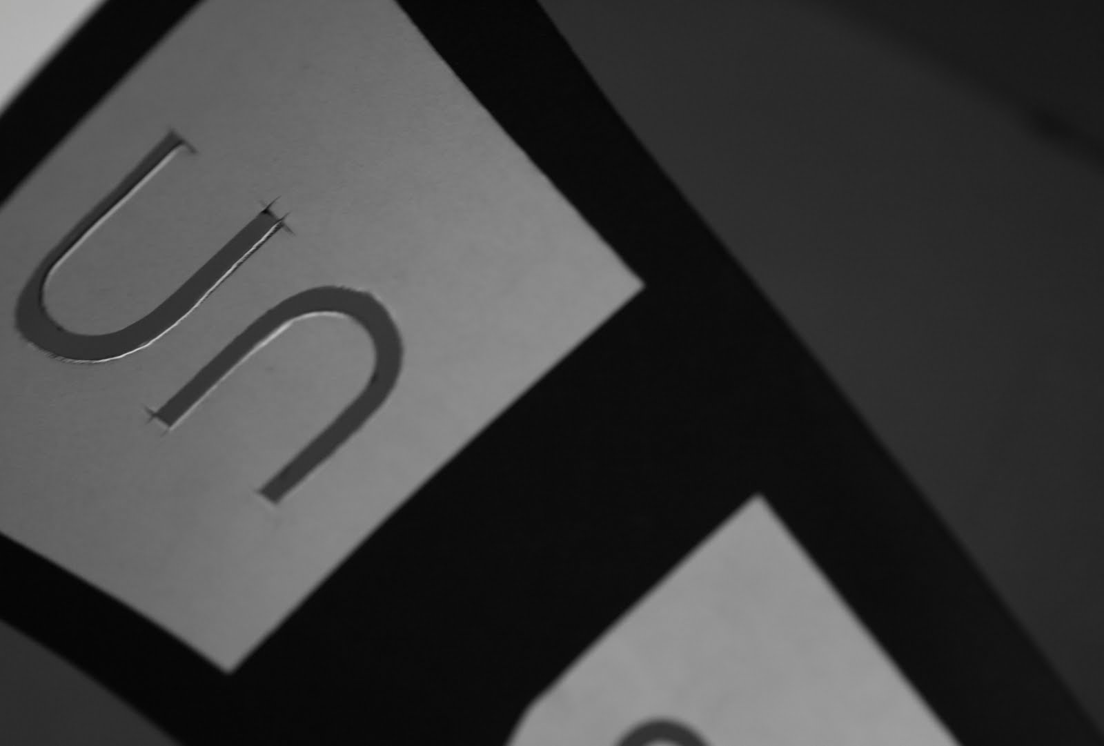
Lots of time spent cutting letters for yearbook embossing.

Wednesday, 11 May 2011

Unseen Cover Emboss Practice

For the mock-up of the book we have decided to include details such as cover finishes as well which will give the photography students a much better idea of what they are to expect. For this we will be producing a white foil on the reverse and a blind emboss on the front.

Emboss Testing through mangler in Studio 1 produced very subtle results and resulting glue stuck to the paper made stencils stick in place and was particularly hard to remove, the glue then removed the white foil placed by Chloe and Emma:


The resulting deboss impression on the reverse however was really nice:


We will therefore be using the vinyl cutter downstairs for the white foil representation and the press in the print rooms for the embossing.

Unseen Promotion Applied Print Processes

Post-meeting with photography although only 1 person attended the direction for the design of the promotional material was liked. I have since decided to look more at how these could be printed and in what different ways. I may be able to do a limited amount of work in the college myself but nothing could beat time and effort in sending them to a professional printers.

I am still playing around with layout and I still need the final content for the promotional material.


01. Full Spot varnish/emboss on grey.
02. Unseen detail in black on grey with Spot varnish/emboss background.
03. Full Black foil on dark grey.
04. Full Spot varnish/emboss on white.


Graphic Exchange & AGIdeas Studio.

Friday, 6 May 2011

Poly-bag Research


Creating boxes for the yearbook is both costly and if done by hand very time consuming. I suggested packaging the yearbooks in as something as simple as a bubble bag. They are very cost effective and although I havn't been able to find a place that prints onto them I will keep looking.

Having recieved a sample of the poly bags from simplyenvelopes.com the bags are perfect. I am interested however in what more we can do in terms of creating a felling of limited edition in packaging.


Photography Exhibition Promo Concepts

As we have been tackling the yearbook for the photography students we are also to start looking at the promotional material to co-inside with the exhibition. I started sketching a number of ideas exploring the communication of unseen through typography and layout through the logo. Communicating an idea of unseen as being:

+ Hard to see
+ Barely Visible
+ Subconcious
+ Dark
+ Broken up
+ Cryptic
+ Unreadable
+ Tiny/miniscule
+ Not to be seen
+ Fragmented
+ Overlooked


Tuesday, 5 April 2011

Yearbook Cover Ideas

I had a play with looking at the presentation of the cover, suggesting different ways of communicating unseen and testing layout possibilities. I really like the look of just using a simple print process to communicate the unseen concept on the cover.

Meeting to Address Spreads with Emma

Based upon feedback from the rest of the group it was agreed that the photography layouts needed more consistency and so myself and Emma sat down to discuss and work together to solve how to make the flow of information more structured. This was a good opportunity for us to sort out any issues regarding what we thought the book should look like.

The grid system has now added rows which i suggested. This keeps the information more concsistent across the book and adds in specific row heighs which can be continued throughout the book.

The internal title page also now aligns left as I suggested.


The columns for the individual internal pages have now changed from 4, 3 and 2 column widths to just 3 and 2. This makes the layout more consistent and it was agreed that the 3 column allowed us larger image quality and optimum words per line and space on the page.


The headers are all a consistent 12pt and body text is in 7.8pt. Headers are also lit with a regular/bold appearance to add emphasis to the concept of 'unseen'.


Adjusted Book 05.04


Friday, 1 April 2011

Unseen Layouts: Full Book


I took control of making the mock-up of the publication that we are creating for the photography students. Overall it gave me a good indication of how each of the layouts fit together and how I needed to rectify them for the book to have an interesting yet consistent flow.

+ Particular annoyances we to do with inconsistently sized fonts, differences used in bold/italic/regular etc and uneven use of spacing and lines which were to be a subtle feature of the design. I completely gutted the book of inconsistencies.

I think these inconsistencies will dilute the design of the cover, and the concept of unseen. Each layout seems so detached from the next. I adjusted grid system to accommodate 6 rows with a 12 column grid.

Wednesday, 30 March 2011

Limited Edition Yearbook Packaging Sample

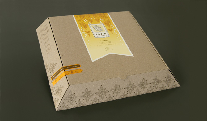
Based on the initial research into packaging I proposed an idea using the box as a limited edition way of encasing the yearbook and editioned print. I also showed how print processes could be used. The design is a simple cardboard box and uses an embossed band to hold it together.

I proposed this idea to the photography clients and they really grasped the idea behind using packaging instead of an internal gatefold. I proposed this concept only and suggested using my contextual research the range of different and innovative ways of presenting the book in limited edition.

Tuesday, 29 March 2011

Year Book Packaging Contextual Research

The photography students are looking for a limited edition of their book to be given to select individuals which should encase a limited edition print of on of their pieces of work. Initial ideas were to do with encasing the print within a gatefold at the beginning or end of the publication.

I propose having a edition of books encased in packaging with a print enclosed, this has far more advantages:

+ A gatefold does not properly encase the print and may slip out.
+ The gatefold is costly, and adds around £500 to our budget. This is due to it being hand folded, a large amount of stock required and a lot of paper waste.
+ The gatefold has to be used within all the yearbooks as it it too costly to limit to say 50.
+ Packaging in a number of 50 means they can be produced within college by hand by us and the photography students.
+ There are a wide range of packaging formats and they can protect what is enclosed unlike the gatefold.
+ Finishes can be added to add a limited 'special' feel to the editions.

There are many formats a few initial ideas I had included:
- Boxes (although these could be expensive)
- Thin Book Bags
- Bubble wrap bags
- Cellophane wrap
- Plastic bags
- Paper Wrapping + Stickers

Tuesday, 22 March 2011

Photography Logo Refinement

After getting the designs back from the photography students, they approved one of the particular typefaces but there we issues:

+ The design looked too much like just a typeface of a written word.
+ The design could better express the concept of unseen though it's positioning and use of gradient.
+ A better balance should be created between the letterforms.


To recrify the design I altered the typeface by removing serif detail, making the weight more even, and altering the 's' completely to make the logo more evenly spaced and the 'e' was alter also to make them more rounded. The 'un' now also sits back using a 50% tint, communicating the 'seen' element much more.