Showing posts with label Yearbook. Show all posts

Tuesday, 29 March 2011

Year Book Packaging Contextual Research

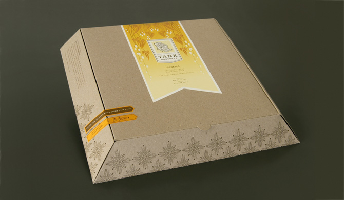
The photography students are looking for a limited edition of their book to be given to select individuals which should encase a limited edition print of on of their pieces of work. Initial ideas were to do with encasing the print within a gatefold at the beginning or end of the publication.

I propose having a edition of books encased in packaging with a print enclosed, this has far more advantages:

+ A gatefold does not properly encase the print and may slip out.
+ The gatefold is costly, and adds around £500 to our budget. This is due to it being hand folded, a large amount of stock required and a lot of paper waste.
+ The gatefold has to be used within all the yearbooks as it it too costly to limit to say 50.
+ Packaging in a number of 50 means they can be produced within college by hand by us and the photography students.
+ There are a wide range of packaging formats and they can protect what is enclosed unlike the gatefold.
+ Finishes can be added to add a limited 'special' feel to the editions.

There are many formats a few initial ideas I had included:
- Boxes (although these could be expensive)
- Thin Book Bags
- Bubble wrap bags
- Cellophane wrap
- Plastic bags
- Paper Wrapping + Stickers

Tuesday, 8 February 2011

Pulp

Pulp is a book by London based agency KentLyons in collaboration with Generation Press and GF Smith celebrating the process of making paper.

Yearbook Contents & Microsite

I was asked to look at the contents page and the microsite. The imagery that I had used was particularly liked and so based on the one I produced earlier I created a few different ideas that used the same concept.

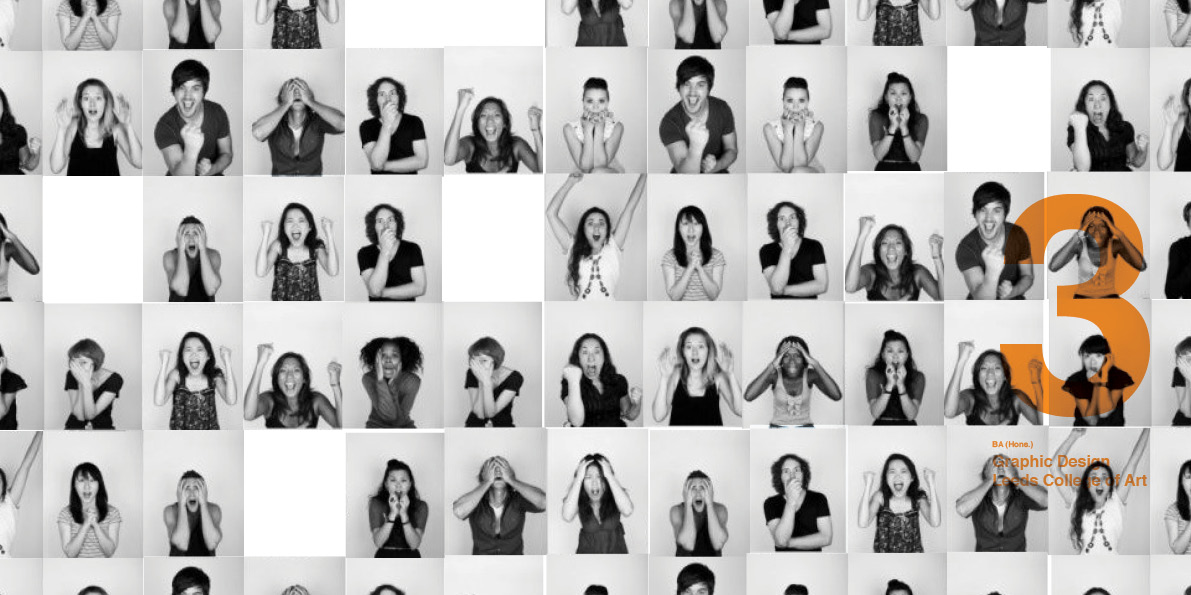
Showcasing all the students within a neat grid system. I really like the comparative values and the way each one has character is really interesting. I also created a more spaced out version below and which utilized the space a bit more and gave each individual a more exposed placement.


I added a contents bar based upon the designs that heather and emma were working on.


For the design of the microsite I simply took the contents page and reversed the navigation, adding more elements. I really like the exposed element of the design, showcasing the people before/behind the work first exposes them.


To illustrate how the navigation works myself and heather proposed screen shots of the design. So the splash page above leading to the designers menu below. The drop-down menu expands and as you scroll through the names the associating pictures light up blue in-keeping with the colour pallet.


Each persons work is shown in a fairly similar layout to the yearbook itself with the overlaid information bar. Associating test can be shown below with additional contact details and website based upon the designer's preference. A light book tool could be added to show larger images of work that is in thumbnails.

Group Chat Evaluation

After proposing the concept to the group I am feeling it really hard at getting my opinion across. I feel strongly that without and underlying concept hat defines what the design is about we are merely producing something for no reason and the design elements will not work together because of this.

My main concern is the concept, there is none. Forward thinking is not a concept, it bears no relation to the yearbook and the end of the 3 years studying. It cannot easily be illustrated and as a concept it is far too broad.

My second concern is the fact that in-spite that been no concept there have been a number of decisions made that should be made once a concept has been outlined. The concept will drive the design decisions such as the colour, type, format, even the layouts.

I am also concerned about the mimicking of something that has already been produced. In particular the Pulp Book by Generation Press, because of the way the print processes and the format have been replicated in particular the use of a box which could have been designed very differently.

I was also asked to have a look at how much the book would cost. Given there has been talk of producing a box, which again has been brought from no-where. Producing a die-cut box will increase the costs dramatically and with only £2500 to spend the idea of creating a box and print processes will skyrocket the price. I did contact Team impression and gave me an idea of the costs involved a basic litho- print, perfect bound, 120 page book in the dimensions given with an uncoated stock cover and pages is £1500 for 1000. I think is important to note that it was not asked for in the brief, luckily I wanted to contact them anyway and am going to visit them next week.


I feel that to grasp the idea of the yearbook and for everything to work in sync there needs to be a concepts that drives it. I am going to go ahead with my concept expose, but I am currently unsure whether to go on with the collaboration to save what lorenzo spoke to me about the integrity of my work within the collaboration.

Quick Yearbook Ideas: Expose

Working on the year I started thinking about who is was going to be given to and why and suddenly it popped into my head, we are exposing ourselves. Not in a nudist way but in the way we are exposing our creative talents to the industry, so I started to play off this idea and worked from there. I managed to sample some imagery from Getty Images, that communicated the concept well and I started working with the basic layouts and how they themselves could communicate exposed. There are several design ideas that I think would communicate it well.

Exposed

+ Stock
- Raw/uncoated
- No shine
- See-through?

+ Format
- open - box, gatefold
- Exposed bind/cover

+ Colour
- Limited - Black, white + accent colour
- Tonal ranges of grey/black

+ Typeface
- Stripped down - just words (helvetica)
- No serif details

+ Photos
- Black and White
- Monotone
- Coloured photos of people's work are the exception
- Content - Real photos, actions shots, no cheesy photoshoots, people doing what they do
- Over exposed, blinding flash

+ Logo/Front
- Stripped/exposed
- Emboss, accent colour only
- Images of people on the outside (exposed)

Limited Colour

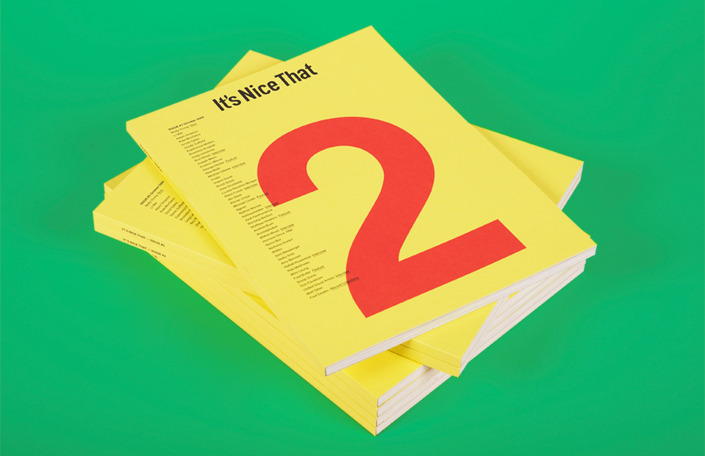
It's Nice That publications, love the list on the front, bright stocks and monotone imagery.


More Studio, Love the strong orange, mixed with delicate serif details.


Pau Mau, bring coloured stocks into the publication design, it has a real depth. against the black and white imagery.


Misc & Tim Wan, overlay of colour.

Yearbook Ideas Mini-Mocks

Given the size of the book has been decided I thought it worthwhile to look at the format and play with the interactivity which would hopefully form a concept in itself. It was clear from previous years that the cover would be embellished with a 3, and in-keeping with the previous year it would be a sans serif format.


I really like the idea of extending the cover, and having an element that would require folding/ opening something up. Here I suggested how the cover could be extended and reveal the people underneath the work. As a concept I think the 'people behind the work' could be really nice and put not just the work we have done forward but have an underlying sentiment behind the work and with pictures displayed together gives an impression of a community.


I suggested the idea of having another extension here in the back and could be used to display a 'hidden' group photo. Again I think most people on the course would like to do this for the sentimental value of the group photo.


Exaggerating the feature the cover could form a tri-fold. I also introduced the idea of an accent colour which could be used throughout the book and the binding.


Taking the idea of revealing again I suggested how the photographs could be even more well hidden into a cover jacket so the only time it can be seen is when it is taken off. I really liked this format because it could be transferred into a poster design which could be taken out and the jacket could be produced in a limited edition for just us students and associates.

Also trying out a vertical belly band.


I'm also really fond of the sentimental quotations, after all they formed the basis of almost all the talk that Fred did throughout the year.