Wednesday, 1 June 2011

Ticket Design


Design Development for the ticket design for the breaking waves exhibition at the Dana Centre, London. From initial directions the final design came together to co-inside with the poster design, using the darker imagery for the background.

The designs were then perforated and foiled to give a high spec considered finish.


Changes to Exhibition Guide

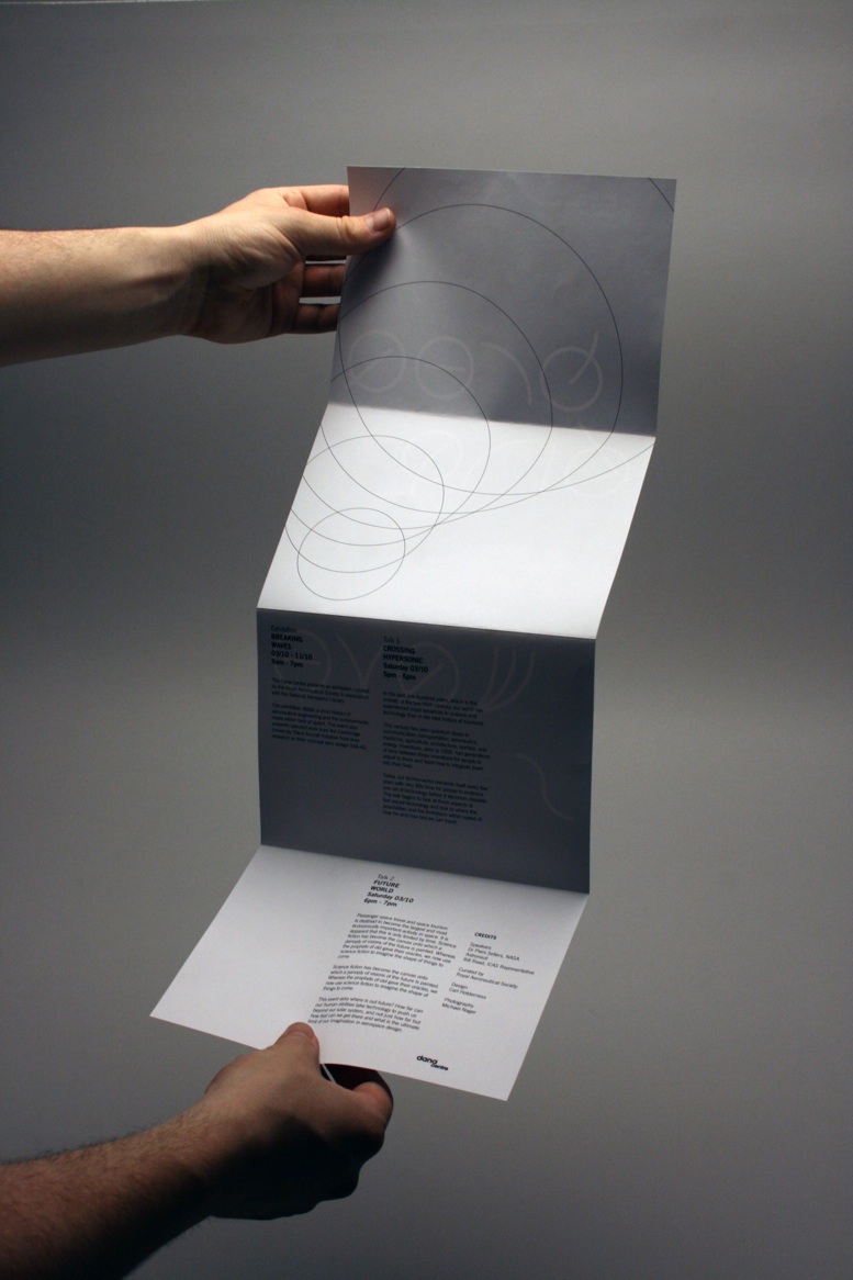
After spending most of the evening last night in the print rooms I was disappointed with the exhibition guide that I had designed. The format was simply too small and the amount of detail within the design didn't reflect the minimalist aesthetic that I had used for the design of the rest of the promotional material.


Joe suggested using a longer more custom format similar to his chromatologies leaflet would be more appropriate. Keep the design minimal also and avoid putting those images of aircraft in as it let the view know too much before they enter the exhibition. Instead use the consentina fold as more of a design feature as oppose to simply a format and hopefully the design of the type will come though as the strong communication tool. The result was far better.

Raw Type Part 2 Ammendments

With the second part of the brief well underway I was disappointed with the printed outcomes from downstairs, even it they are from James' printers. Had to go through a way colour changes to get the right look that I wanted through adding more channels and simply altering the colour balance of some of the images. Overall however I am really pleased with the colour. It is far more dramatic and gives a really good perspective on high altitudes nearing space.

Added details for Tote Bag

For the design of the tote bag which is printed two colour I created a quick label which is attached. Although Joe did say that the barcode does not look really I would still very impressed of the consideration behind the design.

The design is black foiled onto a 250gsm card.


Exhibition Mock-up for Raw Type Part 2

To give a better impression of a considered approach to the range i've proposed an exhibitions space that utilises the type design as part of the interior signage for the event. For this I simply used google sketch-up as it is free and fairly simple to use once you get your head around it.

I actually had no initial drawings or sketches for these so the design came about as a made it. The renders that were produced were actually very detail and could be scale upwards for a print quality resolution.

Design Development for Context Calendar

I started playing around with the format today for the design context publication. I chose to design a calendar on a personal decision, I felt it would be something far more unusual and if crafted well reflect my practice at its best. I also chose it for it's longevity and the more engaging value of having a calendar in constant view for a year, I feel I would love to have this calendar on my wall than a book that collects dust on a shelf.


Based upon the ongoing research that I have been undertaking on the blog for my design practice the calendar will form a achromatic documentation of several typographers and design studios that have influenced my practice over the past year or so. The calendar will give an opportunity for any new designers starting out in type design a good number of designers to look out for and links of books and websites that are particularly useful.


I liked the idea of showcasing a particular piece of type on the front of the calendar with a perforated peel-off design so that the back ban be read for more information on the designer/typographer.


The document below illustrates the layout and the order of the selected designers that will be used for the calendar design.

Doppler Type Specimen and new Promotional Poster

I quickly produced a specimen booklet to showcase the experimental typeface that I produced. The booklet shows the two typefaces and the science behind the design.