Wednesday, 30 March 2011

Design Context: Nous Vous Visit

After talking to Jay at the christmas party he gave me a card and a piece of his work and said to get in touch about coming down and having a chat. I gave him an email the other day and although he is currently doing some work in london for a few days he was more than happy for me to come over and show me his studio space.
I went down on thursday and ended up having a really good chat for probably nearly 2 hours! The studio space where he is set up is near the WY Playhouse, its a really old and somewhat neglected warehouse/office space, but the amount of space that was available and just having a complete environment that was quiet where no-one would bother you was actually really nice. I asked him all sorts of questions about the things he was getting up to and looking at. As it turns out he has currently being back and forth from london working on an interesting education project, he is also working on the re-vamp of the Nous Vous Website and a couple of comissoins. ]
I asked about where he started and how from finishing his degree he found work and so oninturn this led to the discussion on my portfolio and Jay gave some great crituque, not just about the work but about the presentataion and delivery. Jay left uni and took a more relaxed approach to the development of his worka and didn;t setup the collective until over a year of leaving uni and spent his time working and simply earning a living. And for he first few years of the collective a steady job was used to pay for the expenses of his creative side.
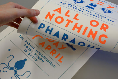
On my portfolio jay commented he enjoyed more looking through the tactile piece of print that i had produced rather than the more mundane and somewhat cliche of having my work presented in photographs in plastic sleeves. Something to think about would be the packaging of my portfolio.

On the subject of originality for my dissertation it did in fact crop up. Jay's studio space didn't actually have internet access and that brought up questions about how he finds inspiration and how looking at other people's work can influence your own. Jay talked about how jay will create something and then as time moves on other people may look at his work and although he may have disliked it, someone will pick it up and to an extent copy the visual styling. Jay believes that orginality is something that in today's design world it does not exist, especially in something such as graphic design and it shouln't be seen as such a benchmark to set your work against.

Design Context: Experim Typography


For my design context i am looking at type-based designers and studios, i am looking at what people are producing, are they experimental, who is producing innvoative typefaces that push symbolism. Where are these typefaces being used and how well are they recieved, how do you push typography and who are the clients and do they have this appreciation for rich, diverse and experimental typographic forms. How are they being experimental, through shapes and forms, materials, processes, layouts?

My design context relates to my design practice very hand in hand. The influence of what I am looking at and where I can take it further greatly influences the origins of my orginality in the type that I produce.

Below I have attached a selection of work which has influenced the type that I have been producing.

Non-Format - Computer Arts Cover (I have one at home!)
Studio in Norway, design for the music industry, fashion and art direction.


Calango - Typogami Animated typography
Netherlands based typography

Design Project - Re-bag Shopping Bag
Leeds based graphic design studio covering a variety of disciplines.


NousVous - Kibbokift
Small collective based in Leeds and London, predominantly working in the creative sector, visuals are lit with experimental typography, illustration and installation.


Effektive Studio - Render Branding

'We were approached to name and design the identity and website for a startup architecture & CGI studio based in Aberdour, Fife. The chosen name Render, is relevant to the business as they specialise in the rendering of 3D architectural drawings and visualisations. The creative approach was derived for the name render and the way that un-renedered images and objects are displayed by the way of a wireframe box with strikethrough. Using these boxes we created a bespoke type based identity and graphic language which is modular in its design and like architectural building blocks can be moved, stacked and used to create a variety of shapes and designs.

The business cards below have been white foiled into 540gsm duplex colourplan as well as the design and implementation of a Cargo based CMS website.'


Made Poster Initial Ideas

After a meeting last thursday, it is clear my involvement in this event is going beyond design and I am somewhat co-ordinating the event. Exciting but I don't really have the time. For the event there has been some word of a private view, this to me seems that there will be a invitation only event for the opening of the pop-up shop. This I think would actually fail, students in particular might feel that there is something they have to sign up for or worse pay for entry. I believe we should market the shop as open using the flyers and further marketing the opening of the event using posters and other marketing tools on the first day.

Final Made Flyer to Print


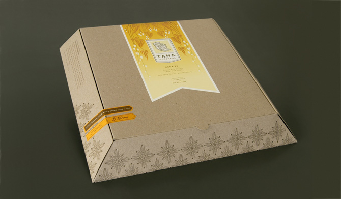
Limited Edition Yearbook Packaging Sample

Based on the initial research into packaging I proposed an idea using the box as a limited edition way of encasing the yearbook and editioned print. I also showed how print processes could be used. The design is a simple cardboard box and uses an embossed band to hold it together.

I proposed this idea to the photography clients and they really grasped the idea behind using packaging instead of an internal gatefold. I proposed this concept only and suggested using my contextual research the range of different and innovative ways of presenting the book in limited edition.

Tuesday, 29 March 2011

Year Book Packaging Contextual Research

The photography students are looking for a limited edition of their book to be given to select individuals which should encase a limited edition print of on of their pieces of work. Initial ideas were to do with encasing the print within a gatefold at the beginning or end of the publication.

I propose having a edition of books encased in packaging with a print enclosed, this has far more advantages:

+ A gatefold does not properly encase the print and may slip out.
+ The gatefold is costly, and adds around £500 to our budget. This is due to it being hand folded, a large amount of stock required and a lot of paper waste.
+ The gatefold has to be used within all the yearbooks as it it too costly to limit to say 50.
+ Packaging in a number of 50 means they can be produced within college by hand by us and the photography students.
+ There are a wide range of packaging formats and they can protect what is enclosed unlike the gatefold.
+ Finishes can be added to add a limited 'special' feel to the editions.

There are many formats a few initial ideas I had included:
- Boxes (although these could be expensive)
- Thin Book Bags
- Bubble wrap bags
- Cellophane wrap
- Plastic bags
- Paper Wrapping + Stickers

Monday, 28 March 2011

BAGD Yearbook Images

1. Made Poster/flyers


2. All Aboard Records Promotional Material


3. All aboard records Stationary formally photographed

(need to photograph)

4. Foxx Typeface on t-shirt photographed


5. Types of Cities e-book cover or actual book covers photographed