Friday, 13 May 2011

Mock-up for Photography Students

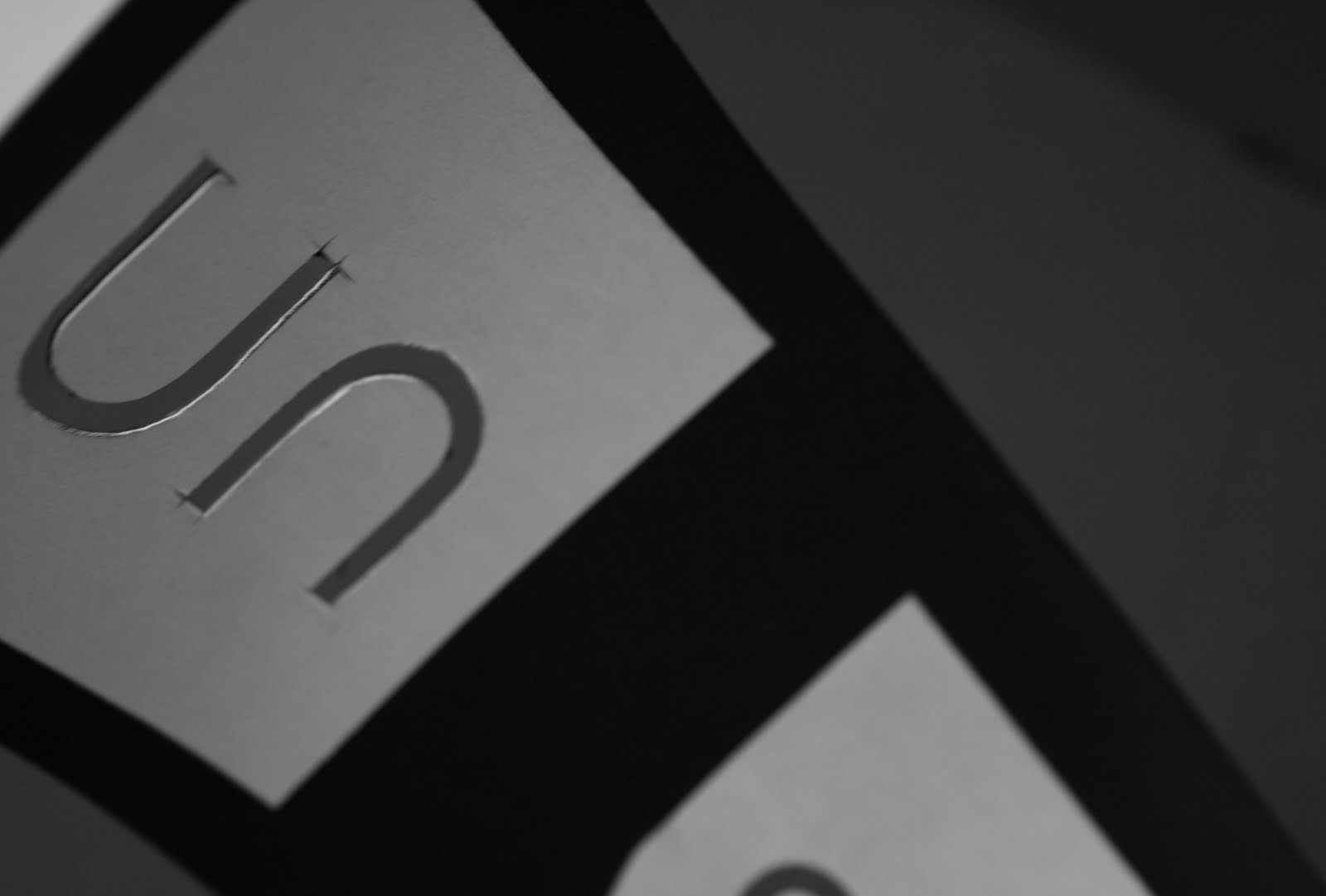
We clubbed together to produce a mock-up of the design for the photography students to see and amend. I helped adjust the foreword page with the amends and created the emboss detail on both the front and back of the book. The spreads look great and the composition of images that Chloe, Emma and Heather worked on look great. The fluid layout also works really well and the bind by Chloe works really effectively.

Photos courtesy of Heather.

Emboss Pieces for Unseen Mock-up

Lots of time spent cutting letters for yearbook embossing.

Made Poster Revisions

After reviewing my design on the silk screen I was not happy and decided I could do better. I decided to go back and play around a both the the composition of the bag, how many there were and use of colour and layout.

The final design I have selected is the first, although similar to the previous design it uses less ink and sits well with the other promotional material. The red bags will be screen printed with the black being digitally printed over the top.

Thursday, 12 May 2011

Factory 4 Newsletter formats and layouts

The factory 4 newsletter is to be created to provide a communication point between the members and possible new members to find out what is going on, who's joining/joined, and what new businesses are starting up/existing.

The newsletter will also provide a base for promotion of the facilities and entice new members to join through engaging with current events and keeping an up-to date creative mindset.


Pat Mehbrei via typography served and below David & Chloe's Leeds College of Art newsletter.


I've began looking at simple formats like the consentina fold and the book format. The document should be 8 pages long to accommodate:

1 page - cover
2 pages - featured member of the month
2 pages - news and exhibitons in Leeds
2 pages - new business of the month
1 page - about/pricing/facility details etc

Wednesday, 11 May 2011

Unseen Cover Emboss Practice

For the mock-up of the book we have decided to include details such as cover finishes as well which will give the photography students a much better idea of what they are to expect. For this we will be producing a white foil on the reverse and a blind emboss on the front.

Emboss Testing through mangler in Studio 1 produced very subtle results and resulting glue stuck to the paper made stencils stick in place and was particularly hard to remove, the glue then removed the white foil placed by Chloe and Emma:


The resulting deboss impression on the reverse however was really nice:


We will therefore be using the vinyl cutter downstairs for the white foil representation and the press in the print rooms for the embossing.

Unseen Promotion Applied Print Processes

Post-meeting with photography although only 1 person attended the direction for the design of the promotional material was liked. I have since decided to look more at how these could be printed and in what different ways. I may be able to do a limited amount of work in the college myself but nothing could beat time and effort in sending them to a professional printers.

I am still playing around with layout and I still need the final content for the promotional material.


01. Full Spot varnish/emboss on grey.
02. Unseen detail in black on grey with Spot varnish/emboss background.
03. Full Black foil on dark grey.
04. Full Spot varnish/emboss on white.


Graphic Exchange & AGIdeas Studio.

Tuesday, 10 May 2011

Badges for Ollie for Stamp

I've asked Ollie to print a few badges for the photo-shoot tomorrow for the yearbook. In terms of expanding the range it is important to cover everything, these could in fact be sold at the pop-up shop as well. And Ollie earned £5.00 aswell.